Project 1: Modular Typeface Design
Phase 1 Report
Student Name: Maxwell Bachman-Whitney
Client: NAMI (National Alliance on Mental Illness)
Name of the typeface you will design: Balance
Major influence:
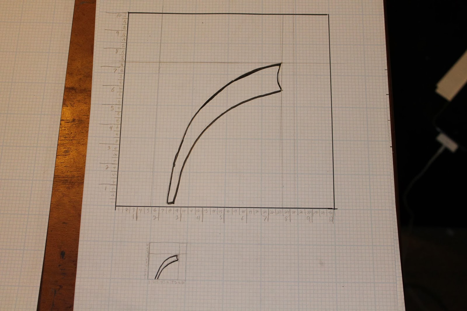
- Balance is a high contrast type face combining sharp triangular edges and long sweeping curves to create a sense tension.
- Balance is influenced by the struggle of people who try to operate in a normal everyday environment with mental illness. A group of diseases that is often disregarded or considered to be less valid.
Origin of the name:
- The name Balance is a direct reference to the lives of people who struggle with mental illness. "A mental illness is a medical condition that disrupts a person's thinking, feeling, mood, ability to relate to others and daily functioning."(NAMI.org) People often have to deal with others diminishing or ignoring the severity of their mental illness.
- Balance is inspired by the amount of effort it takes to operate and function under these conditions. The good days and bad days, the self-doubt and everything else that is involved in coping.
Describe how you will translate the major influence into design elements:
- The typeface will represent these influences by showing contrast between sharp and jagged angles paired with long flowing and swooping lines. This contrast is supposed to mirror the balancing act people with mental illness put on.
Describe the process of converting the design elements into a typeface:
- Long stem like strokes and elipses will be the smoother side of the modules. While the other modules will involve many triangles, diamonds and rhombus'.
Describe the patterns that will originate by the design modules to the typeface:
- There will not be any consistent patterning other than the saw like combination of sharp angles.
Phase 2 - Idea generation


No comments:
Post a Comment